Spotify Analytics
A personal project exploring how to visualise your Spotify listening data in a more meaningful way.
As someone who spends a significant amount of time listening to music, podcasts, and discovering new artists on Spotify, I always found Spotify Wrapped to be one of the highlights of my year. But I wanted more—I wanted to see my listening habits throughout the year, not just at the end of it.
This side project started as a simple question: what if I could see my top artists, songs, and podcasts at any point in time? What patterns would emerge? Would my listening habits change seasonally, or stay consistent?
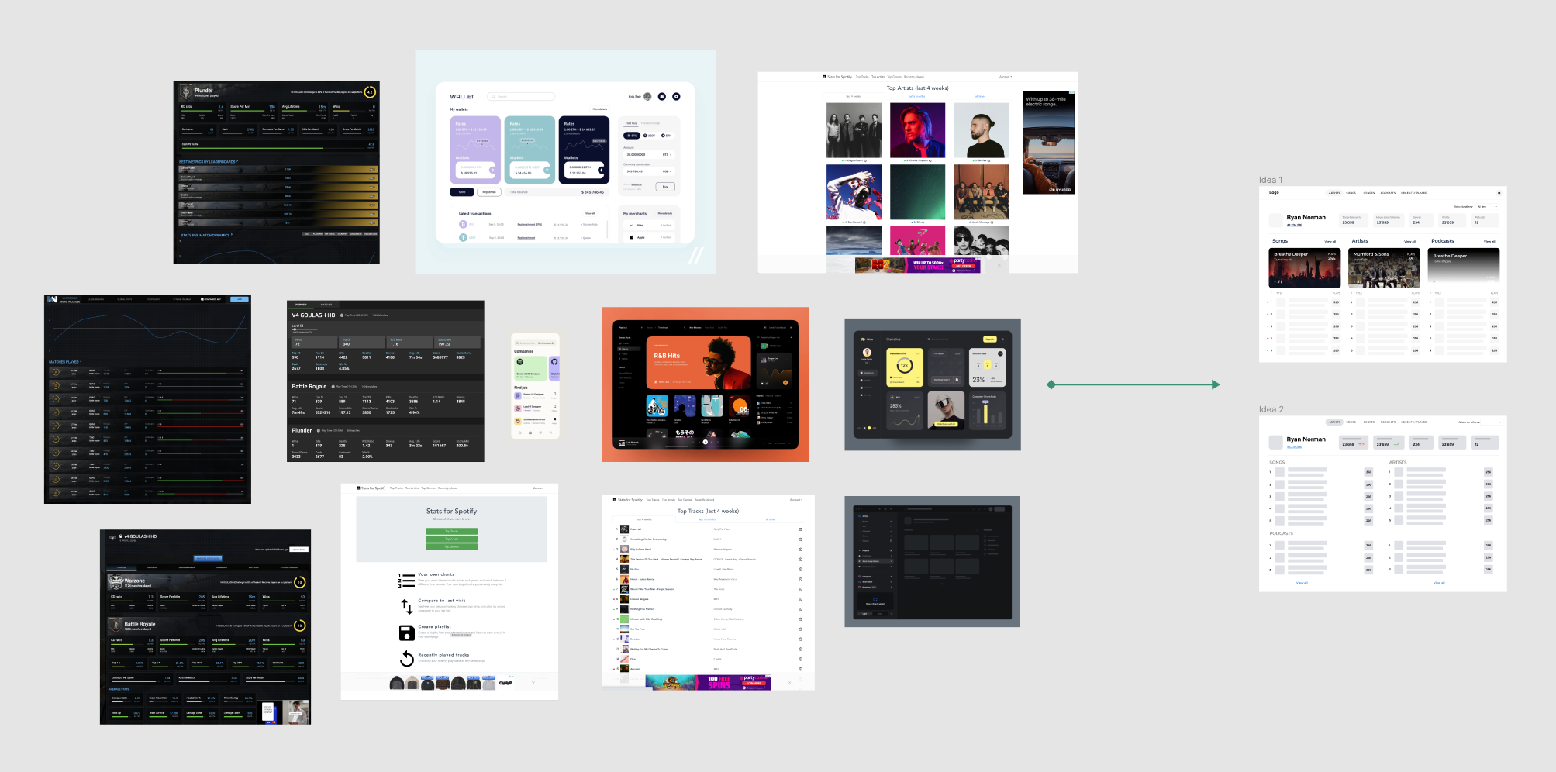
I began by researching existing solutions and gathering inspiration from various dashboard designs—financial apps, gaming statistics platforms, and of course, Spotify's own interface. I wanted something that felt familiar to Spotify users but offered deeper insights.
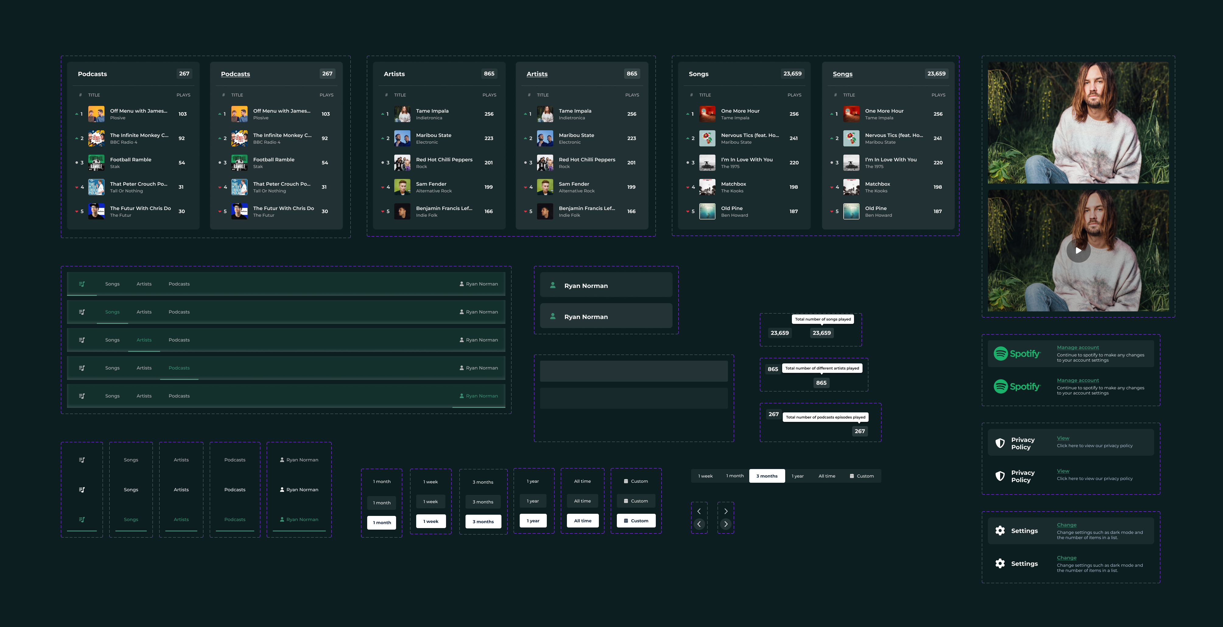
The design process involved creating a comprehensive component library first. I designed various states for list items, navigation patterns, time period selectors, and data visualisation elements. This systematic approach meant I could iterate quickly once I moved into prototyping.
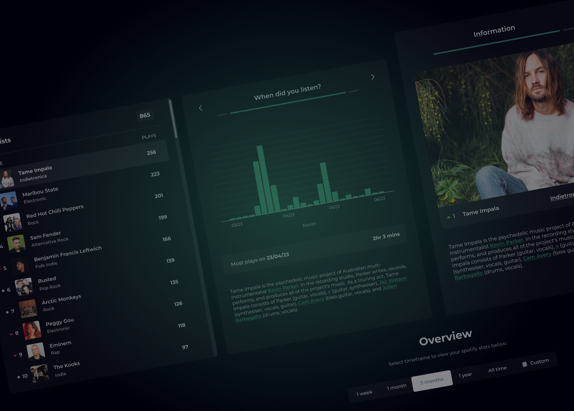
The final prototype allows users to view their listening statistics across different time periods—from the last week to all-time. It shows not just what you've listened to, but when you listened, with charts revealing your listening patterns over time. The artist detail view pulls in additional information, giving context to the music you love.
Building this reinforced something I believe deeply: the best way to learn is to build something you genuinely want to use.